Merkert Tech
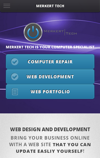
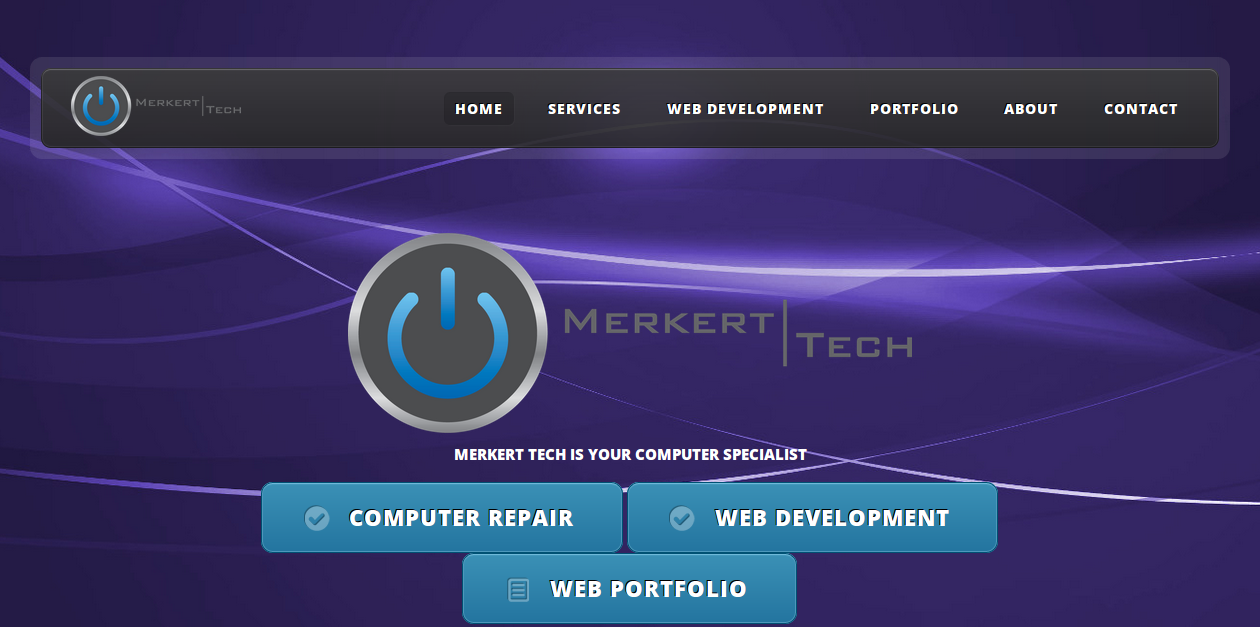
MerkertTech.com was just recently redesigned with all new responsive web design. This allows the site to display differently on different devices. For example, on a smart phone with a small screen, there is a different view of the site which fits better on small screens. This site is the format in which most new sites should be created in, to allow users on all devices to have easy access to your site.